Promang
From Founder-Led Relationships To A Brand Built On Confidence
SOPHISTICATED, REASSURING, PREMIUM
Promang is a luxury real estate consultancy serving ultra-high-net-worth buyers and investors. While the founder had built a strong reputation through personal relationships and successful deals, the brand itself failed to communicate that same level of trust, expertise and refinement.
The challenge was to create an identity that could carry the founder's credibility into every client interaction—allowing prospective buyers to understand the quality, reliability and sophistication of Promang before the first conversation ever took place.

CONCEPT AND STRATEGY
For clients making investments worth a lifetime's savings, confidence matters as much as opportunity. The identity needed to feel established, dependable and discerning while reflecting the premium nature of the properties Promang represents.
Art Deco became the foundation of the visual language. Its architectural geometry, symmetry and timeless elegance naturally connected the brand to the world of luxury real estate while reinforcing ideas of permanence, craftsmanship & value.

At the heart of the identity is the North Star
—A symbol historically associated with guidance, reliability and unwavering direction. For high-value property decisions, clients aren't simply purchasing real estate; they're placing trust in expertise.
The North Star became a visual metaphor for Promang's role as a dependable guide, helping buyers navigate complex decisions with confidence and clarity.
VISUAL LANGUAGE
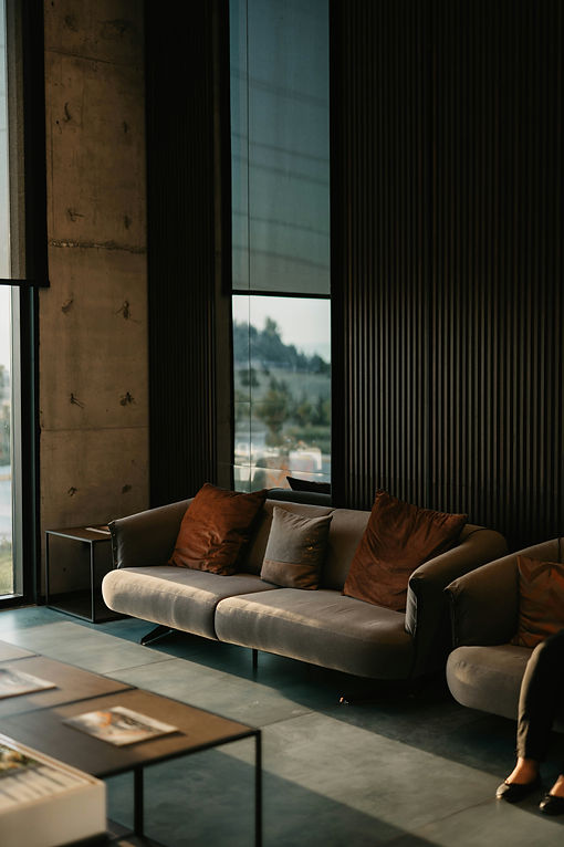
The visual system combines Art Deco-inspired geometry with rich materials, refined typography and restrained ornamentation.
Together, these elements create a brand world that feels sophisticated without being ostentatious—reflecting the calibre of properties and clients Promang serves.


To elevate the client experience, a bespoke coffee table publication showcases Promang's portfolio, expertise and success stories. More than a sales tool, it serves as a tangible expression of the brand—communicating quality, attention to detail and market knowledge through carefully curated content and presentation.
MAP OF CHOICE
The brand extends into editorial and storytelling pieces that simplify complex buying journeys. Through custom illustrations and narrative-driven communication, Promang positions itself not merely as a broker, but as a trusted advisor helping clients find the right investment and the right home.




WEBSITE
The website was designed to translate the identity into a digital experience that feels immersive, elegant and considered. Large-format imagery, editorial typography and a restrained visual rhythm mirror the confidence and sophistication expected by Promang's clientele.


The resulting identity transforms Promang from a founder-led business into a brand with its own presence and authority—one capable of communicating trust, expertise and luxury long before the first meeting takes place.